Kibble: a Design System

Fuzzy was a startup that provided on-demand, virtual veterinarian care alongside health and wellness products.
I led a small team of designers in iteratively rebuilding our design system over the span of four months.
COMPANY
Fuzzy
MY ROLE
Senior Product Designer
IMPACT
40–78% lift in conversion rate across top-of-funnel pages.
The task at hand: to rebuild a fragmented and incomplete design system.
When I joined Fuzzy, our design system was split into seven different Figma libraries, didn’t always abide by UX best practices, and was missing key components and variants.
PROBLEM FRAMING AND DISCOVERY

Gathering key insights:
I asked our designers and engineers, “what would your ideal design system at Fuzzy include, how would it be organized and built, and how might it scale and evolve over time? What design, engineering, and workflow problems are you experiencing today that might be solved by a more functional design system?”
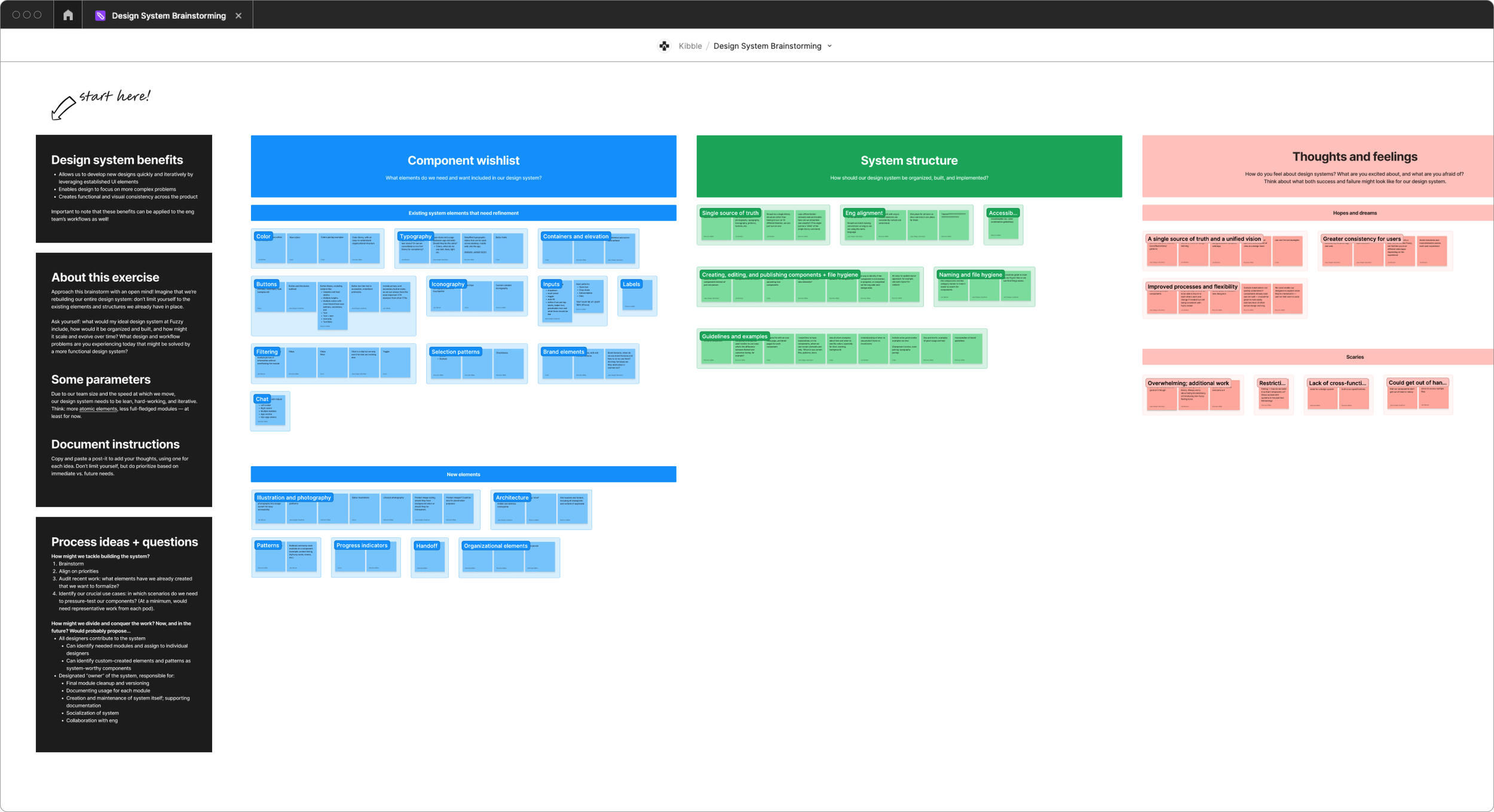
I look forward to having a single source of truth for design and eng.
A better design system would enable me to spend less time creating and editing simple components.
Without a grid system, I don’t know how designs should scale across breakpoints.
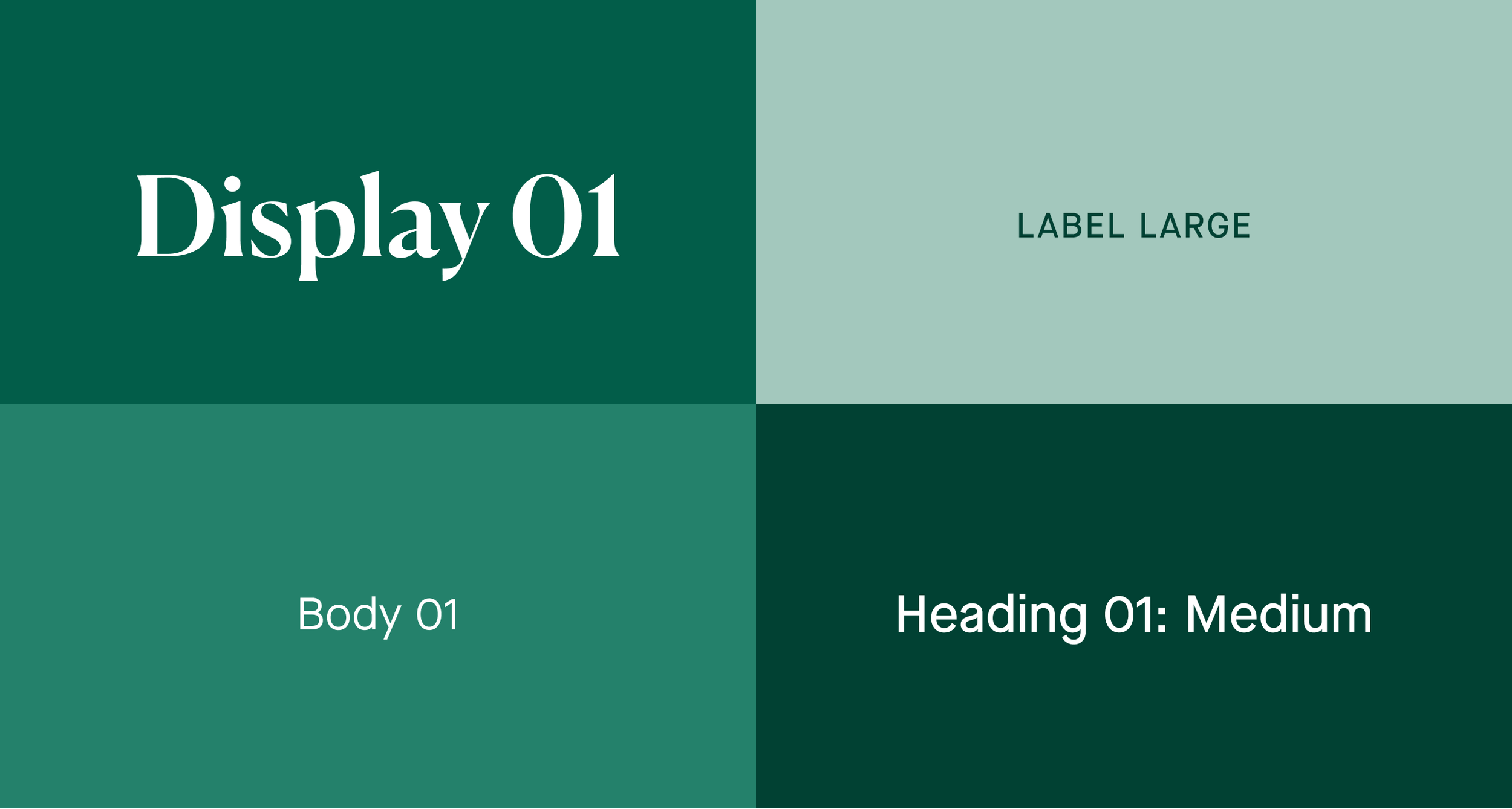
Before creating the full design system, we established baseline styles.
MY SOLUTION
The color palette builds from Fuzzy’s brand, and was created with usability and accessibility in mind.


Kibble’s type styles are broken into four categories: display, headings, body, and captions & labels.
The new grid system provided designers and engineers a set of four consistent grids for xsmall–large breakpoints.

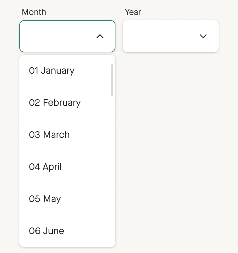
From there, we built a hard-working and iterative library of our most commonly-used elements.
In accordance with general UX best practices, Kibble’s buttons do something, and links go somewhere.


The form library contains text inputs, autocomplete fields, a date picker, and drop downs.


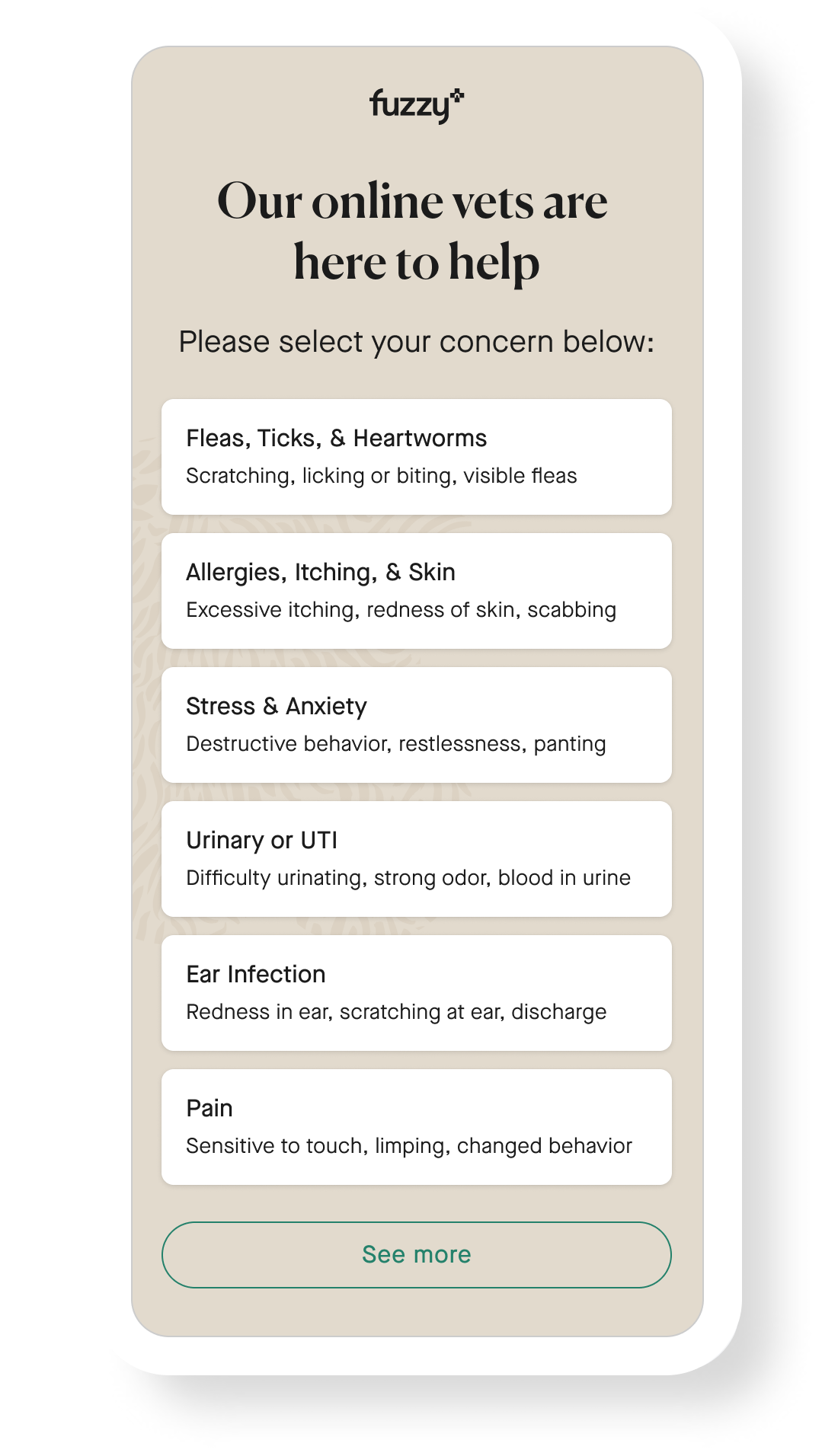
Kibble contains three selection patterns: cards, chips, and toggle switches.


Toggletips are triggered on tap, and can be flexibly placed.


Modals can be configured to accommodate a range of content types.


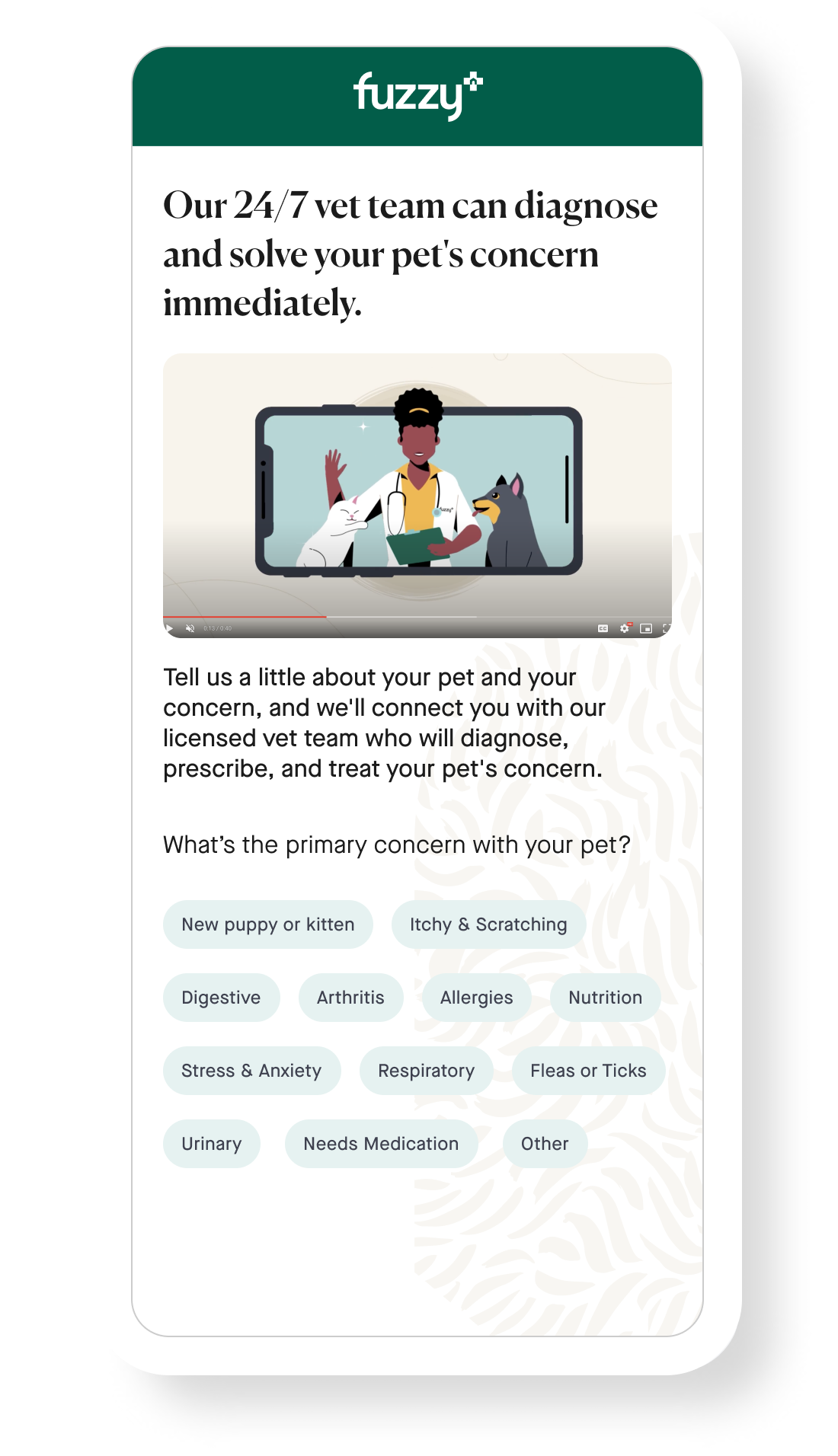
Many of Fuzzy’s users first engaged with the product through diagnostic quizzes, which became Kibble’s testing ground.
The overwhelming majority of our users were on mobile, and these quizzes needed improvement: our old system issues were apparent in problems like small type, hard-to-click selection patterns, poor contrast, and label-less forms. Refreshing these patterns allowed us to pressure test and refine our system while improving our product’s UX.
A QUICK CASE STUDY
Before.
After.
Before.
After.


Before.
After.


Before.
After.


Launching Kibble helped increase top-of-funnel conversion rates by 40–78%.
Once we implemented these new patterns, we saw that users were 40–78% more likely to convert across our top-of-funnel pages, like those shown above. (Okay, okay — some of this is likely due to content updates. But I think Kibble made a big difference).
CREDITS
Design System Contributors: Jess Daiger & Jen Belken
Quiz Designs: in collaboration with Jess Daiger
Lead Engineer: Tyrel Clayton