Starbucks Pattern Library

Digital marketing at Starbucks is a cross-functional, collaborative effort: Product owns the site and app, Marketing dictates the overarching strategy, the Creative Studio writes and designs the work, and Operations builds and deploys it.
I proposed and designed a pattern library — and associated guidelines — to streamline the user experience across that workstream (which spans the Starbucks site, app, and email program).
COMPANY:
Starbucks
MY ROLE:
Senior Designer
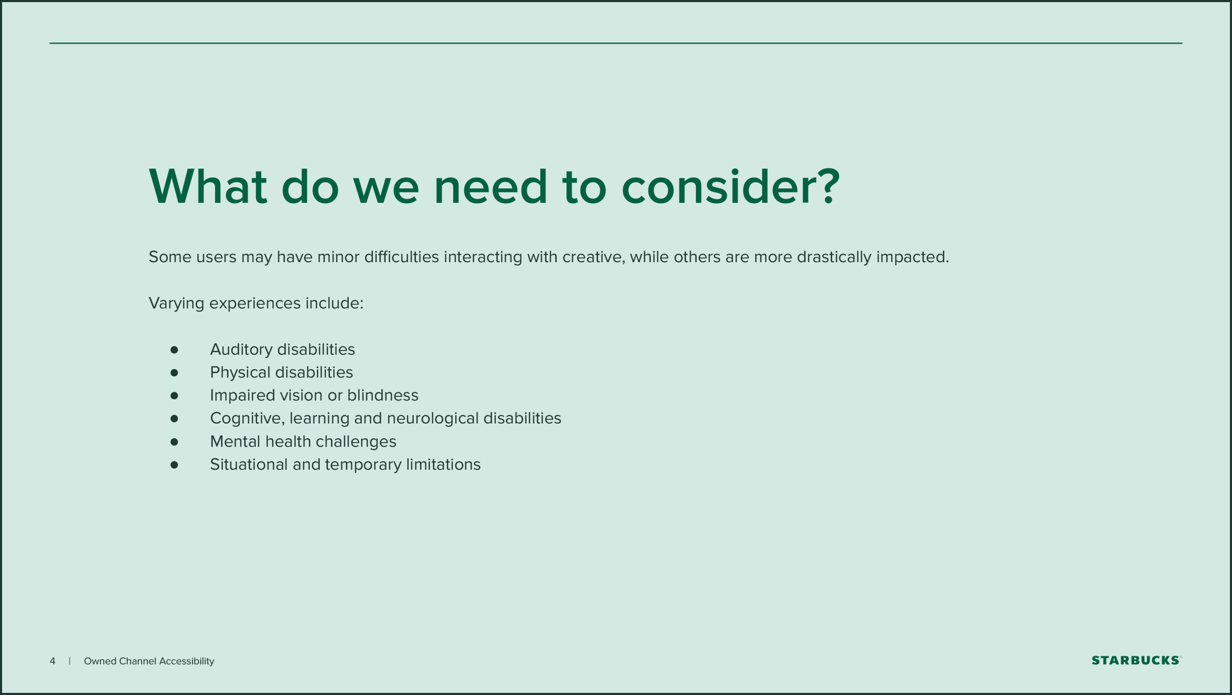
When I joined the Creative Studio, the user experience across all of Starbucks’ digital properties was disjointed and inaccessible.
THE PROBLEM

MY SOLUTION
An accessible, easy-to-use pattern library with a consistent visual language and flexible components.
To be truly successful, this project needed to satisfy a range of internal and external needs: Marketing needed easy-to-understand templates to guide content strategy, creative needed a branded pattern library, publishing needed a developer-friendly, reusable set of modules. (And, most importantly — our user needed accessible, relevant content contained in a consistent shell).
To understand our needs, I audited the existing creative and documented common scenarios.
Then, to determine the look and feel of this system, I pulled elements from the core brand — but left a few things open-ended.
The heart of the Starbucks brand is well-defined and consistent, but each season features its own unique aesthetic… so it was important to embed some flexibility into the patterns.
CORE COLORS
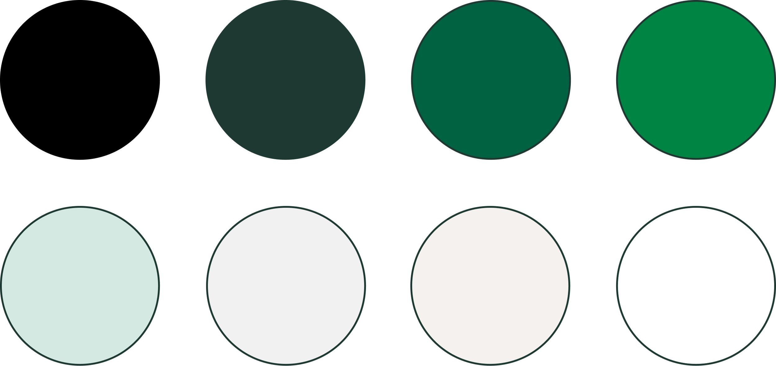
SAMPLE SEASONAL COLORS

CUSTOM TYPEFACES

IN-APP STYLING

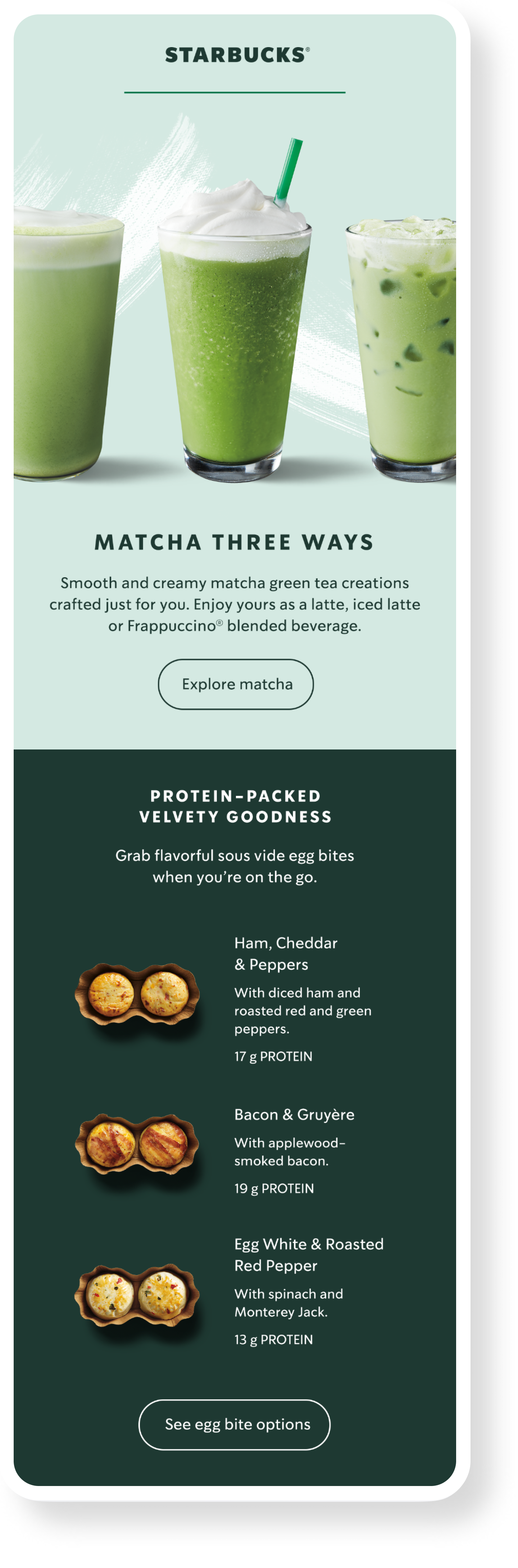
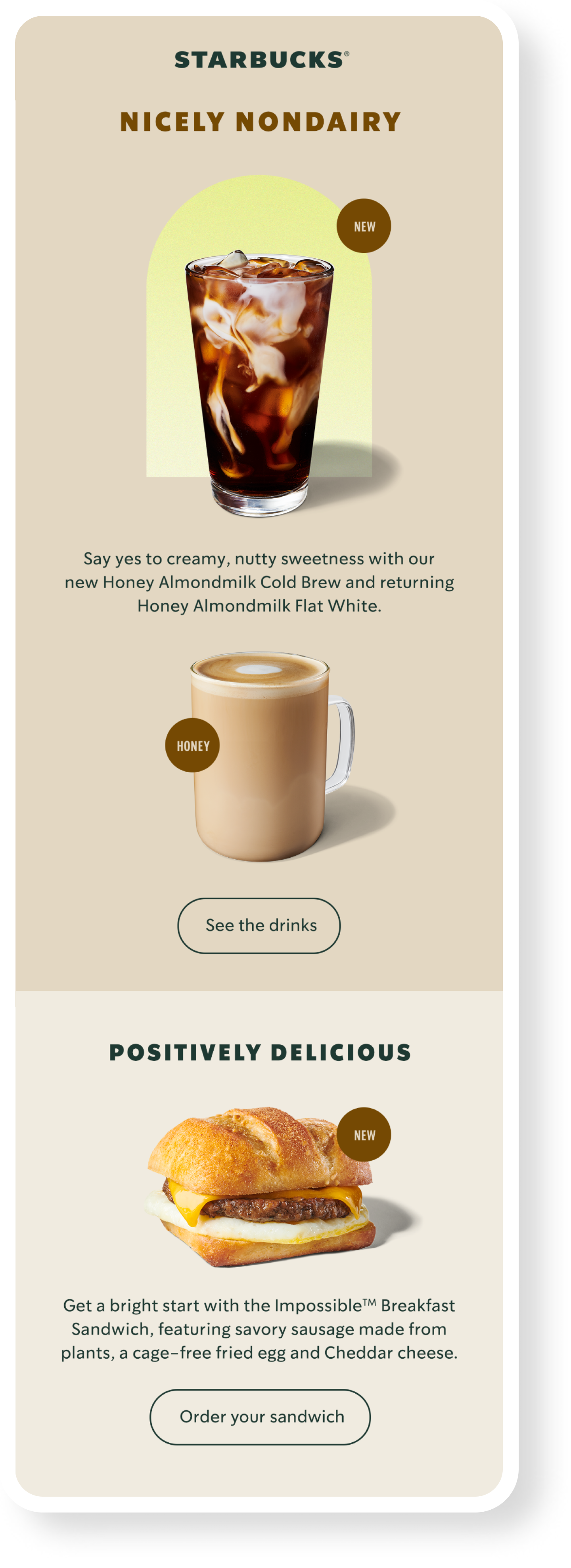
MARKETING EMAILS
Email is the most flexible* digital channel at Starbucks and required a robust set of patterns.
*Weird, right?


I first developed individual atomic styles, followed by the components.


All customer-facing Starbucks emails are now created using this framework.


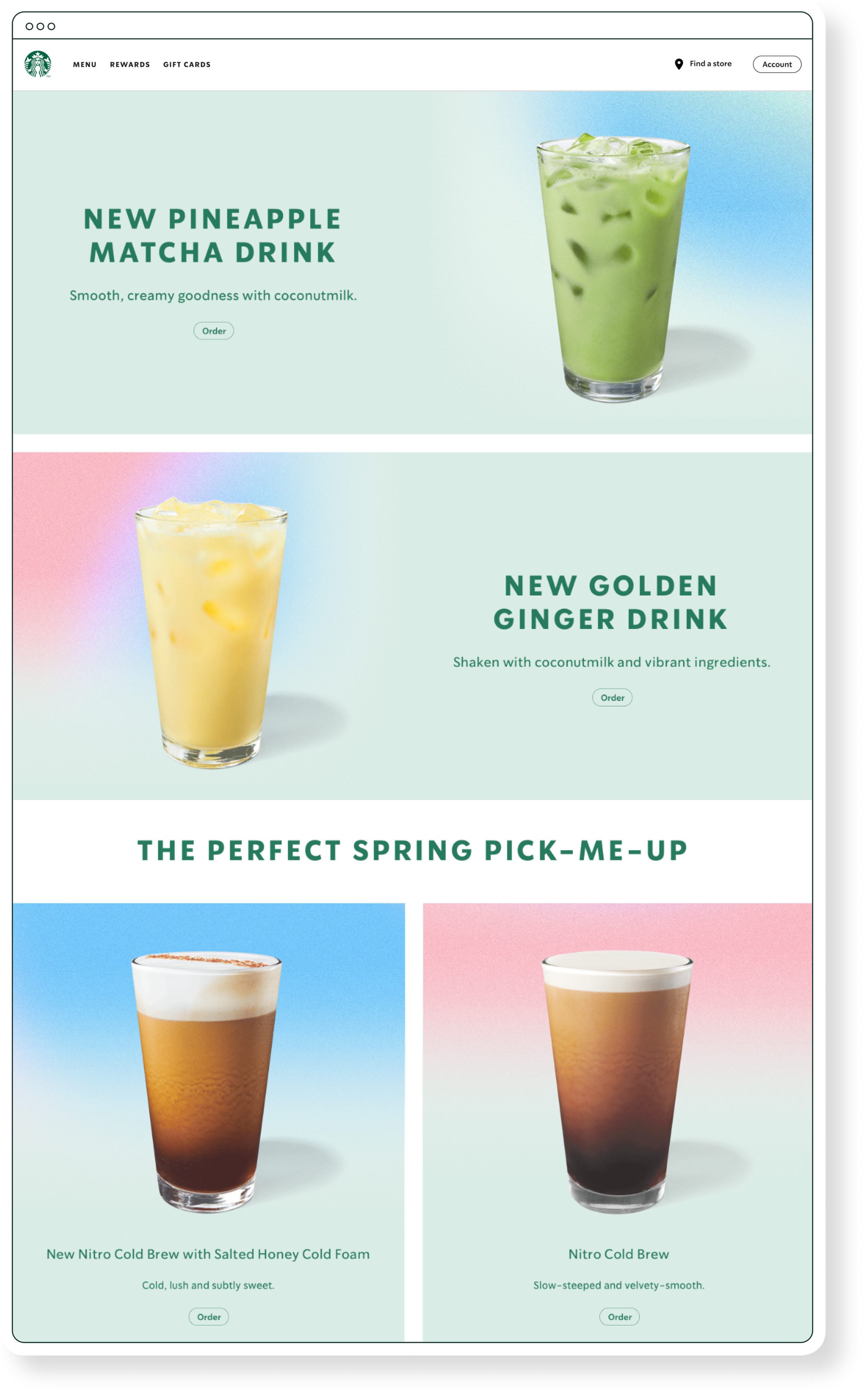
STARBUCKS.COM
The Starbucks site is built from three basic module types.
I collaborated with the Starbucks product team to design and develop this MVP. To keep the engineering lift low while retaining flexibility on the creative side, we landed on three configurable patterns.
1: SIDE-BY-SIDE IMAGE DUO

2: TEXT-ONLY BLOCK

3: IMAGE-AND-TEXT BLOCK

I used those three modules to create a wider range of fixed patterns for our Studio designers.
By dictating height and type styles, I was able to develop a set of consistent modules with a clear sense of hierarchy — ensuring our designers have enough flexibility to create thoughtful and beautiful page structures without being overwhelmed by options.

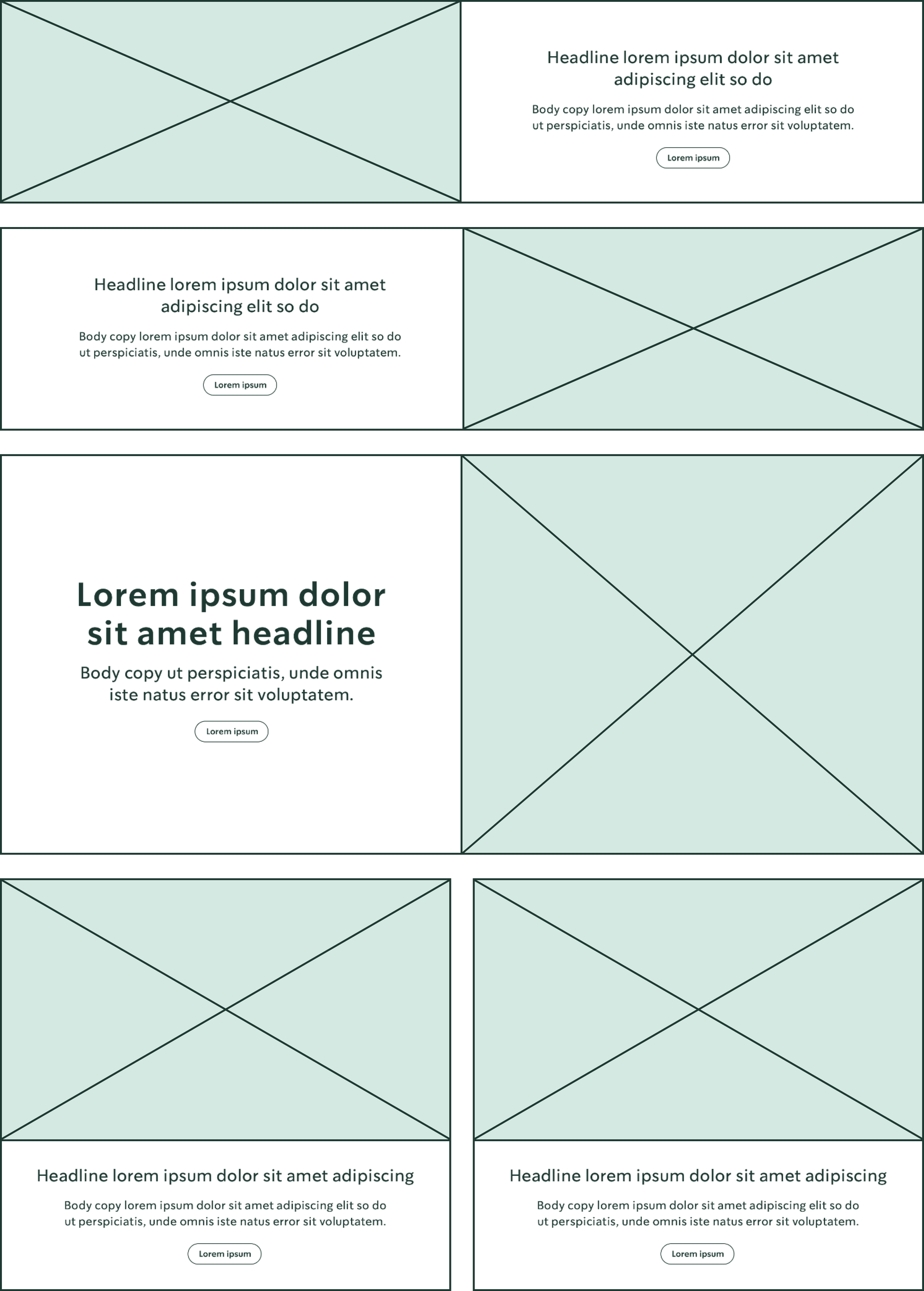

These patterns are now used for promotional, educational, and transactional purposes across Starbucks.com.


STARBUCKS APP
The app only required image and copy guidance for its two marketing placements.


LAST BUT NOT LEAST
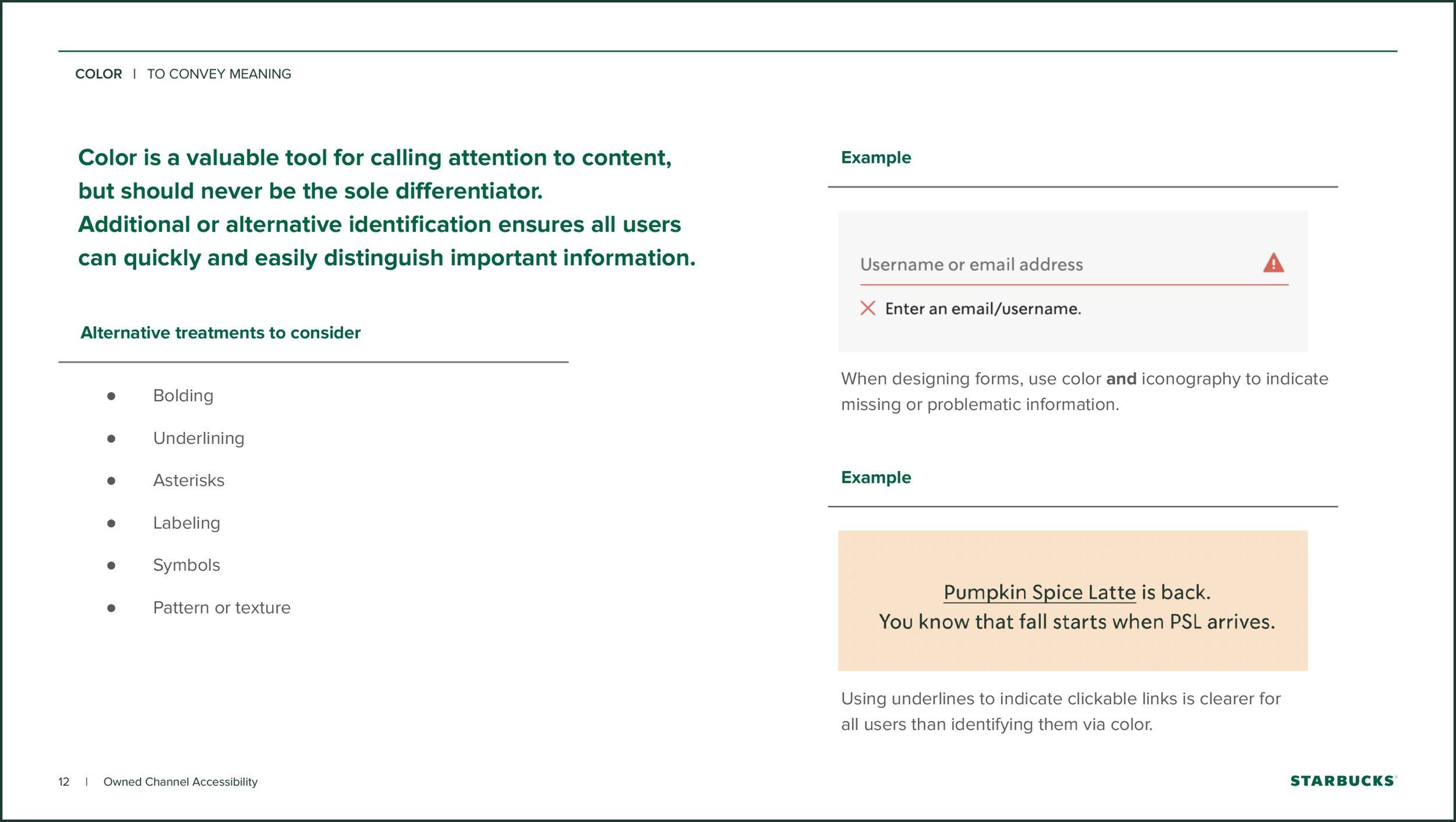
To accompany this pattern library, I proposed, developed, wrote, and socialized Starbucks-specific accessibility guidelines.


CREDITS
Creative Direction: Andrea Hilliard
Copy Editing: Sara Hendrickson
Creative Samples: some by me, others by assorted members of the Starbucks Creative Studio