Articles and Annotations

Newsela is a late-stage EdTech startup that aims to create meaningful classroom learning for every student. Over 90% of schools in the U.S. use their tools to teach scaffolded, relevant, and trusted content.
In my time at Newsela, I oversaw a total overhaul of the article page. This portion of the product houses all of Newsela’s article content and associated activities.
COMPANY:
Newsela
MY ROLE:
Product Designer
IMPACT:
200% increase in teacher annotations rate, and 4% lift in teacher distribution.
OVERVIEW
Teachers rely on Newsela to bring them relevant, accessible articles that engage their students.
Teachers can screen content and modify activities within this view. Students can read (or listen to) the article content, take quizzes, learn key vocabulary words, and more — all on this page.
We redesigned and shipped a new version of the article page to support quizzes, written responses, key vocabulary words, and more.

As we rebuilt this page, one particular feature warranted its own work stream: annotations.
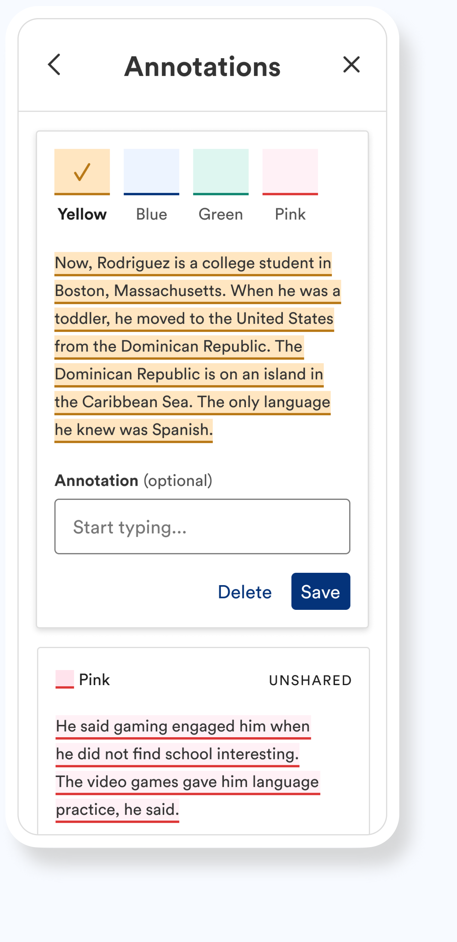
Both teachers and students can highlight any article text in a range of colors, and add their commentary to create an annotation.
Teachers can share their annotations with students, and reply to student annotations. Students can respond to teacher annotations, and view teacher responses to theirs.
A FEATURE DEEP DIVE


Our existing annotations tool was hard to find, inaccessible, and entirely unsupported on small screens.
Very few users were creating or interacting with annotations, and we’d heard complaints during interviews. (Plus, we knew it needed a design refresh!)
THE USER PROBLEM
We identified two potential locations for the feature, and ran an unmoderated study to compare.
QUAL RESEARCH
Option one: annotations switch and overlaid cards.

Option two: annotations navigation item and in-panel cards.

What we heard from our users:
Annotations “mode” should be removed.
Why would teachers want to turn annotations off — or allow their students to do so — if they’d spent the time creating them?
Annotations should live within the side panel.
Teachers responded negatively to the overlapping dialogue box, stating that it obscured the article body.
Threading and responding within the Article view should only be available to students.
Teachers prefer to evaluate annotations based on completion, and outside of the context of the article.
We shipped a discoverable, accessible, fluid experience.
Throughout the design process, I explored questions like: what might an accessible color palette be, especially in the instance of overlapping annotations (and do we prefer brand colors, or more “classic” highlighter colors)? What’s the best way to trigger an annotation? How might this experience scale across all breakpoints?
OUR SOLUTION


A 200% increase in teacher annotation usage, and a 4% lift in teacher-to-student distribution (assign, present, and print).
IMPACT
CREDITS
Design: in collaboration with Kelley Nguyen; original page direction established by Rachel Platt & Dana Givens
Product Management: Emily Taylor & Ryan Dontas
UX Research: Christian Haarhaus
UX Writing: Lisette Walberer
Engineering Lead: Alice Kallaugher
Accessibility Engineering Lead: Amy Turany-Mayer